Book covers
Anonymous 01/11/25(Sat)21:17:27 | 4 comments | 1 images

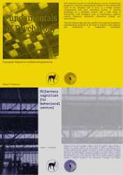
I made these book covers for two hypothetical academic books. It's both the front cover and the back cover. Any criticism will be helpful. You can also post book covers that you find inspiring.
Anonymous 01/13/25(Mon)12:40:13 No.459267
>>459249
Your project remembers me a lot of the Sternberg Press books.
It is good but:
– A book cover should be backcover - spine (if is has one) - cover. Never show it as cover - backcover ever again;
– Use references of Sternberg Press as I think it will inspire you to resolve legibility problems in the title of the yellow one;
– The text in the back cover of the yellow one seems pretty big for something that will be printed, and the one on the blueone seems small. Did you print-test those covers?
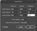
–There is a LOT of holes in the justified text. Use pic related configuration on the justification menu and it will solve it. Use it always as a basics, but adapt when needed. Also, if you hyphenate, please edit the hyphenation menu too, as the default is pretty horrid. It both works for InDesign or Illustrator.
That said, i think overall it does look good. Also it has this "series" feel to it, that is good as they are from the same author. Good job overall, just a few fixes.
Anonymous 01/13/25(Mon)16:19:21 No.459272
>>459267
Thanks for your comment! It helps me a lot to improve. I'll take a look at the references you mentioned and fix the issues as well!
Thanks for your comment! It helps me a lot to improve. I'll take a look at the references you mentioned and fix the issues as well!
Anonymous 01/13/25(Mon)16:26:36 No.459273

>>459272
Sorry, i forgot the pic I referenced. This is the base config so the justified text does not have holes.
If you are using InDesign you can also open the H&J violations checkbox in preferences to review. The text with problems will be highlighted yellow, the stronger the yellow, the worse the holes in the text will make the reading. It is best to check it on large blocks of texts (as in a book page full of text) and you should just turn it on as a review option, and do not work with in on.
Anonymous 01/14/25(Tue)01:37:04 No.459277
>>459249
ugh bro these dont even make any sense and that fucking full text box justification is brutal.
ugh bro these dont even make any sense and that fucking full text box justification is brutal.