Anonymous 01/11/25(Sat)07:53:53 | 4 comments

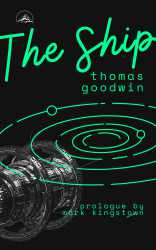
tried my hand at designing a book cover, how did i do? based on a real novel but i changed the names
Anonymous 01/11/25(Sat)19:31:36 No.459247
The font is nice in a nautical world kinda sense.
The solar system doesn't easily fit with the space ship too cattoony and soft everything green. The colors are fine.
The solar system doesn't easily fit with the space ship too cattoony and soft everything green. The colors are fine.
Anonymous 01/12/25(Sun)04:11:52 No.459250
>>459246
The solar system needs to recede more into the background, and the ship should be opaque in front.
The solar system needs to recede more into the background, and the ship should be opaque in front.
Anonymous 01/12/25(Sun)04:24:51 No.459251
theres no real organization or proportion and shit is too close to th eedge
Anonymous 01/13/25(Mon)12:38:34 No.459266
>>459246
– The bleed on the title is shit. Don't bleed it.
–thomas goodwin - mark kingstown. Dude, capitalize those names.
–I do like the solar system a lot.
– The spaceship is low res and I can see it without even needing to zoom.
–The spaceship is also too dark overall with some spots that are too shiny.
–I do like the design/shape of the spaceship, so if you need to change for another one, try to keep it as similar as possible.
Great idea and overall cover, just a few fixes to be finished.