Anonymous 01/05/25(Sun)19:46:31 | 6 comments | 3 images

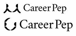
How bad are these? Can they be saved?
I'm not really a graphic designer. I thought it was good enough but I showed it to someone and they didn't even get what it was supposed to be.
I'm not really a graphic designer. I thought it was good enough but I showed it to someone and they didn't even get what it was supposed to be.
CIA Director Marlon Joseph Tesoro Battad 01/05/25(Sun)22:10:14 No.459210
yes, hello, this is some kindo a countdown timer for the Predator series, which is why many shy away from answering your queries
Anonymous 01/06/25(Mon)08:11:13 No.459212
>>459210
wait what lmao
in a good way or a bad way? maybe will job seekers want to "hunt down" better jobs like the predator hunted arnold
wait what lmao
in a good way or a bad way? maybe will job seekers want to "hunt down" better jobs like the predator hunted arnold
Anonymous 01/06/25(Mon)17:33:29 No.459216
>>459208
At first glance, both monograms look like they are missing something, like there is something above them that is blocking the vision. At second glance, the first one look like a handshake, and the bottom one looks like there is one guy about to give a hug and the other one is like "oh no bro, just a handshake, please, wtf".
The "Career Pep" does not have ANYTHING that connects is to the logo beyond the proximity and have no distinct feature on itself, it is just written and that is it, you can have one of those problems, but not both.
Take a step back, get your research, get what you were trying to convey, get your first drafts, and review it. You took a leap in the process instead of letting the research and studies guide you.
Anonymous 01/06/25(Mon)19:03:05 No.459217

>>459216
thanks for the genuine feedback, appreciate that. Yeah they're supposed to be handshakes, and the 2nd one is supposed to be cheering because he "got the job," but I can see why it sucks I just couldn't figure out why lol
The site it's for is supposed to build user's confidence and interview skills in preparation for job interviews. But I think it was way too abstract and just made no sense. I feel like something more in this direction would work better.
Anonymous 01/06/25(Mon)20:32:11 No.459219

>>459217
I am the >>459216 anon. This new versions are really better, good job, I feel it is going to the right direction.
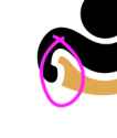
The only problem I see is this connection that I don't like and I do feel that in the printed materials and reductions may be a pain in the ass.
Fix that and then show to your peers/contractors/people in the know to get feedback on it. Keep the good work.
Anonymous 01/07/25(Tue)00:12:58 No.459220

>>459217
Different anon here...
I never would have gotten any sense of that even though it is easily read/ remembered as Career Prep...which it is in a sense, but that's not the name. It's supposed to be unmistakable, like a cattle brand.
"Pep" isn't a very commonly used word outside of advertising and school rallies but people still know that it means high energy and spirits and liveliness or to add those qualities by "pepping up" some one or thing. Because of all that the typeface you use can easily point in a different direction and kill any sense of Pep by being too staid and conservative and sober. It doesn't have to be zany high school Pep rally poster lettering but it's a casual term and any clash between that term and more serious business standards has to be sorted out to get the idea across...who is the audience and what will attract them?
In keeping with the "pep" thing, handshakes are out, fist thrusts are better but too loaded a symbol...but a high five is both casual and instantly recognizable as something indicating circumstances of intense Pep.
Picrel is a generic symbol, you could mirror your figure and develop your own version.
But FWIW all of those symbols like handshakes and hugs and high fives are some of the most oversaturated logo ideas in personal services- almost cliche- so don't box yourself in.
Just emphasizing the two words so that the Pep part suggests a pepping up occurring- maybe with color or two typefaces or bolding or italicizing or AOTA.