Anonymous 12/19/24(Thu)00:41:45 | 12 comments | 2 images

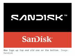
What were they thinking?
Anonymous 12/19/24(Thu)02:33:46 No.459033
Looks cool imo
At least it's not Helvetica
At least it's not Helvetica
Anonymous 12/19/24(Thu)15:54:49 No.459041
I dig it. It's also rare nowadays.
Anonymous 12/20/24(Fri)05:41:50 No.459049
>>459032
that they don't want to be Jaguar
that they don't want to be Jaguar
Anonymous 12/20/24(Fri)18:07:45 No.459062
>>459032
The brand that sold defective SSDs rebrands to a logo where the lower part is missing.
Seems on brand for me.
The brand that sold defective SSDs rebrands to a logo where the lower part is missing.
Seems on brand for me.
Anonymous 12/20/24(Fri)21:35:13 No.459064

That's meant to resemble the traces on a pcb.
Combined with the fact that it is not SansSerifWordmark(tm):
I like it.
Combined with the fact that it is not SansSerifWordmark(tm):
I like it.
Anonymous 12/21/24(Sat)06:19:01 No.459065

Anonymous 12/21/24(Sat)11:03:08 No.459066
>>459032
It looks so much better now? It is better than the boring transitions most other companies are taking nowadays.
It looks so much better now? It is better than the boring transitions most other companies are taking nowadays.
Anonymous 12/21/24(Sat)19:37:46 No.459069
>>459032
It's fine.
It's fine.
Anonymous 12/23/24(Mon)20:10:25 No.459083
>>459032
Looks retro 80s scifi dystopian megacorpish. And that's a good thing.
Looks retro 80s scifi dystopian megacorpish. And that's a good thing.
Anonymous 12/24/24(Tue)01:52:36 No.459085
>>459083
Here's to hoping the future will at least have cool-looking logos.
Here's to hoping the future will at least have cool-looking logos.
Anonymous 01/01/25(Wed)11:09:35 No.459140
SanDick
Anonymous 01/02/25(Thu)01:24:51 No.459146
>>459032
looks like something out of a shitty low budget sci fi movie
looks like something out of a shitty low budget sci fi movie