School project
Anonymous 12/11/24(Wed)03:00:04 | 6 comments | 2 images

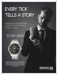
Magazine ad for a watch. I liked my previous iteration before my professor told me to change stuff. Everything shown has to be included. Not sure what I can do to make it look better. Any advice? Much appreciated
Anonymous 12/11/24(Wed)12:10:16 No.458937
>>458930
alright so the only passable part about that typography is the bottom paragraph. everything else needs some serious reworking. you could start by reducing the line spacing in the header, it just looks disjointed like that. and get something more interesting going on with the fonts, especially the "Star Bar"
why doesn't the guy wear the watch? why is he there like "shit, I forgot my clock at home"?
Anonymous 12/11/24(Wed)13:00:59 No.458938
Anonymous 12/11/24(Wed)13:22:20 No.458939
>>458938
yeah now that you mention it, the "available..." paragraph absolutely needs to be below the "inspired by..." paragraph in a much smaller font. basic shit really
>Also, if you can change the picture, change it
if he can't he should just photoshop the watch in the guys hand. it's a trivial task even for a first year student
Anonymous 12/11/24(Wed)14:59:04 No.458941
>>458939
Originally they were in different spots, but professor said to place them there.
Originally they were in different spots, but professor said to place them there.
Anonymous 12/11/24(Wed)15:00:38 No.458942
>>458930
Thanks for the help guys
Thanks for the help guys
Anonymous 12/11/24(Wed)16:33:54 No.458944

>>458941
About the "available at" paragraph, I see you have two options:
–Move it below and try to rationalize with your teacher. Use these ads as argument (there are plenty more online), take a look how the store text is the last on the bottom on both.
– If you really need to place it there, create a hierarchy on your text as people don't read long strings.
Something like:
AVAILABLE AT
Seiko yadda yadda
Starting at OCTORBER 1, 2024
Also, about the watch, make it bigger. Be inspired by other seiko ads.
