Anonymous 08/11/24(Sun)04:05:27 | 9 comments

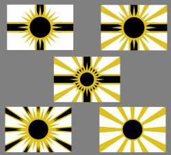
pls rank from best to worst
Anonymous 08/11/24(Sun)13:08:08 No.456773
>>456765
No. You can do this yourself by zooming out as far as possible to see which one conveys your meaning the best. A good flag design needs to be immediately recognizable at a distance.
No. You can do this yourself by zooming out as far as possible to see which one conveys your meaning the best. A good flag design needs to be immediately recognizable at a distance.
Anonymous 08/11/24(Sun)13:41:21 No.456774
>>456765
Bottom right, bottom left, top left, top right, middle.
Bottom right, bottom left, top left, top right, middle.
Anonymous 08/11/24(Sun)13:55:05 No.456776
>>456765
3 > 5 > 4 >>> 1 > 2
3 > 5 > 4 >>> 1 > 2
Anonymous 08/11/24(Sun)21:43:52 No.456790
>>456774
this is close, but id rather go bottom left nd the rest just suck.
but mostly they have a lot of problems and you need a to find a way to organize that handles all the ugly shapes made from the over lappings
this is close, but id rather go bottom left nd the rest just suck.
but mostly they have a lot of problems and you need a to find a way to organize that handles all the ugly shapes made from the over lappings
Anonymous 08/17/24(Sat)16:08:50 No.456881
Anonymous 10/15/24(Tue)22:37:29 No.458018
Here's my ranking:
1. Top choice
2. Pretty good
3. Not bad
4. Meh
5. Worst option
1. Top choice
2. Pretty good
3. Not bad
4. Meh
5. Worst option
Anonymous 10/25/24(Fri)19:14:57 No.458358
They're all good but you need to adjust the sun's shape (the 'direct rays'). The sharp corners that protrude just slightly are ugly.
The last one's 'indirect rays' are maybe too similar to the old Japanese flag, but it's still good. Reminds more of a black hole than a sun however.
If you make the sun fit completely inside of the third one, it might be a nice design as well, especially with the less busy corners of the first one (without the eight extra 'indirect rays').
The fourth one might look better if you reduce the 'direct rays' by half, removing them from inside of the 'black rays'; it's too "busy" this way.
Try a version of the second one without any 'direct rays' as well (basically the last one with a cross).
Anonymous 01/04/25(Sat)04:47:56 No.459182
>>456765
The bottom left is the only good one
The bottom left is the only good one
Anonymous 01/20/25(Mon)16:30:23 No.459407
>>456765
3 > 2 > 1 > 4 >>>>> 5
3 > 2 > 1 > 4 >>>>> 5